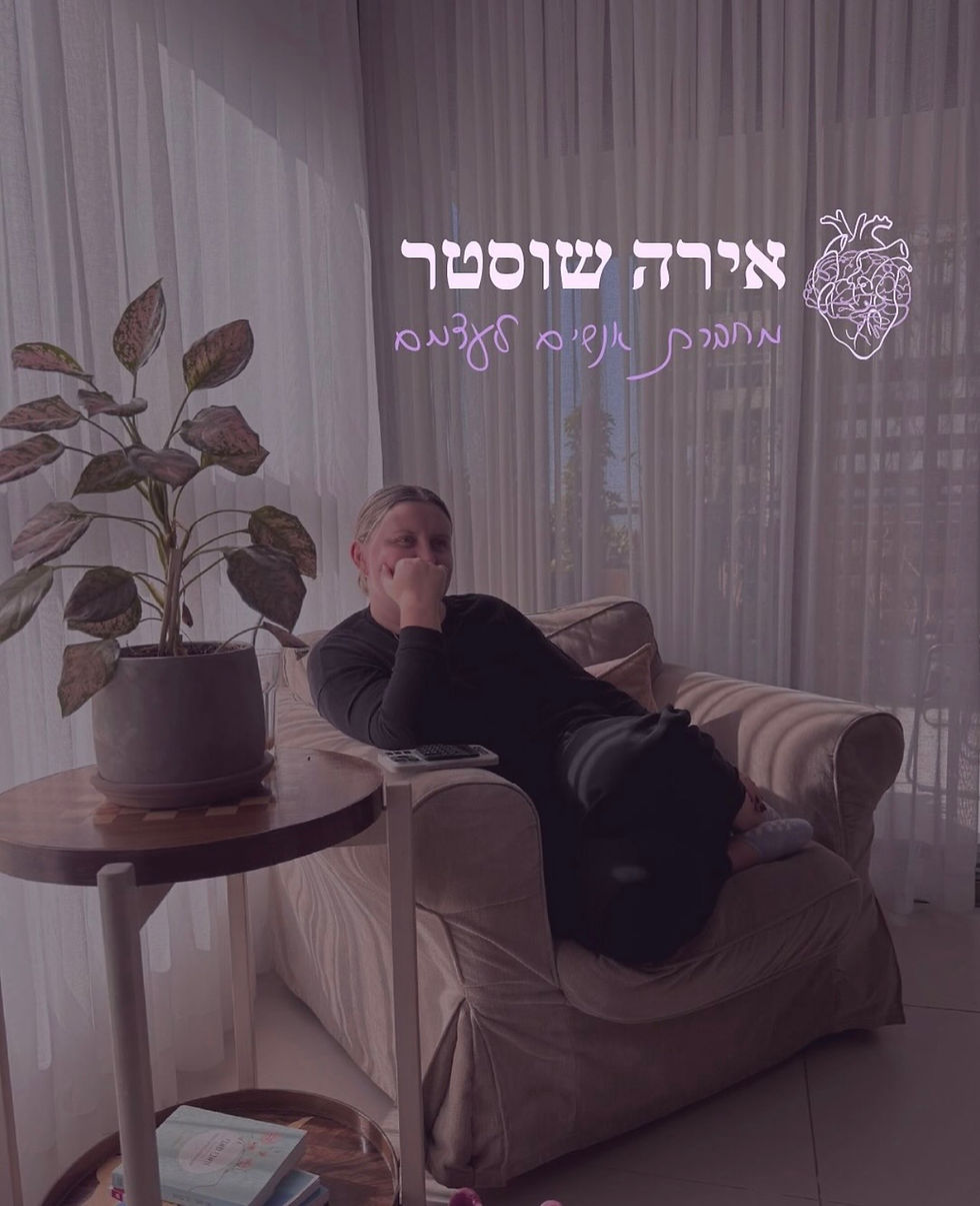
Ira Shuster
Rebranding project for Ira Shuster, a relationship coach who helps people reconnect with themselves. The goal of the brand was to create, through both design and feeling, a sense of personal connection and inner alignment. The brand language is warm, light, and calm, yet still professional and direct, making clients feel safe and at home, while showing that the journey toward self connection doesn’t have to be intimidating.
The visual identity is soft and minimal, yet refined. Purple serves as the dominant color, guiding the brand’s overall tone and concept. The combination of Ira’s handwritten font with a clean typeface creates a sense of ease and intimacy, connecting not only to the brand but also to the person behind it, making everyone feel at home.
Rebranding
visual identity